

Colour play: the thinking behind our upcoming organic poplin collection
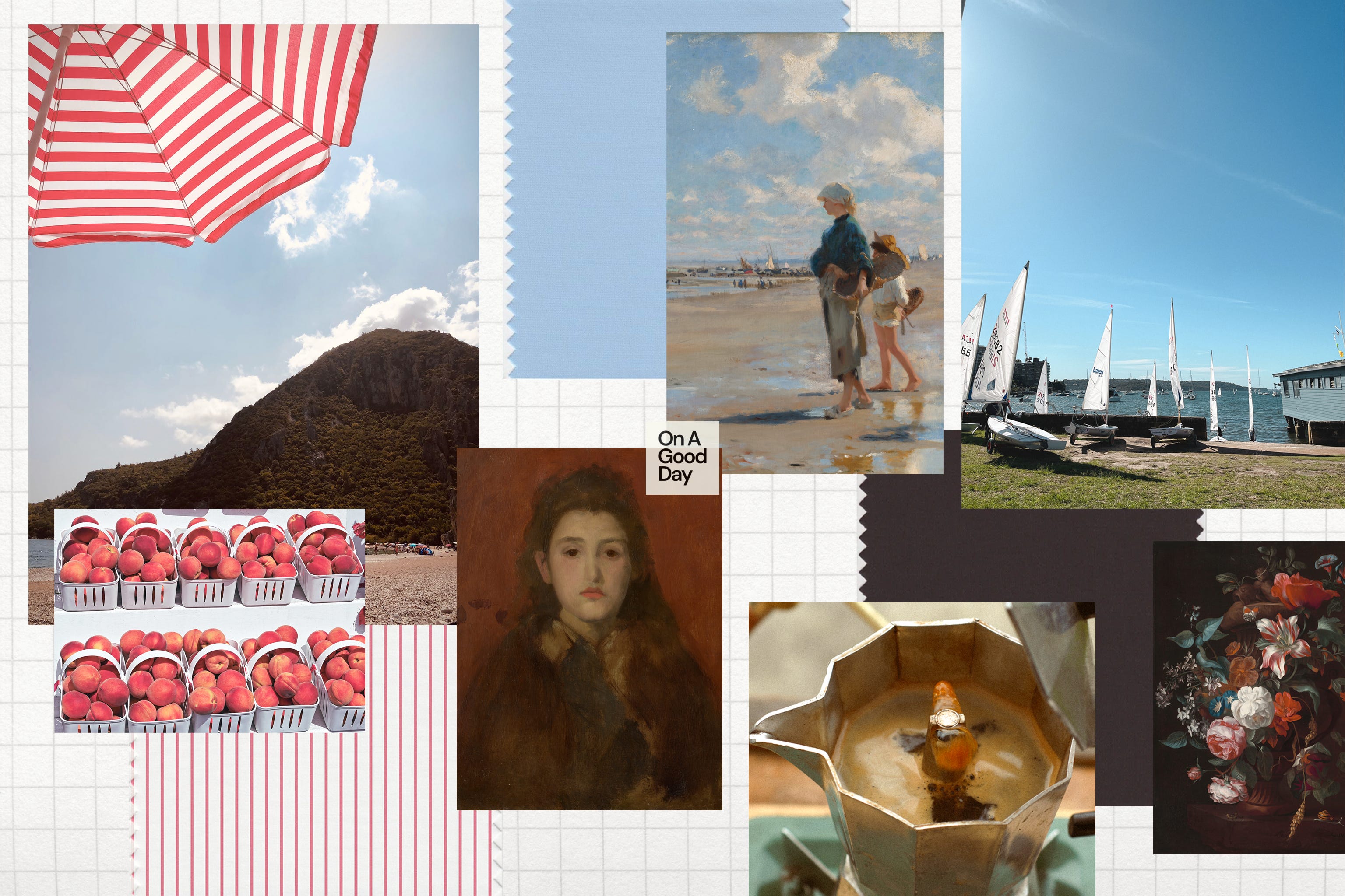
A first look at our upcoming collection's colours, where bright peach stripes meet hazy blue and dark chocolate brown hues.

I’ve always been a big colour person. When I see interior design or architecture content with an extremely muted, minimal palette - which seems to be so popular in the Australian modern design vernacular - I respect the approach… but think to myself, that would never work for me! Even if I started with a neutral palette, it wouldn’t be long before I would be adding in a blue lampshade, a striped tablecloth or cushion cover to liven things up a bit. For me, colour is happy making.
Dreaming up the colours for our next collection - crafted from organic crisp cotton poplin - I wanted to create a palette that was versatile, and very easy to mix and match, without being a sea of neutrals. A set of colours that feel alive, but don’t dominate, and most importantly, play well together.
The anchor: chocolate brown
A deep, dark chocolate brown serves as the base for the collection. Think a 90% cocoa chocolate, pour over coffee kind of brown. Functionally, it fills the space of black - but adds a bit more interest and somehow lifts everything with it.
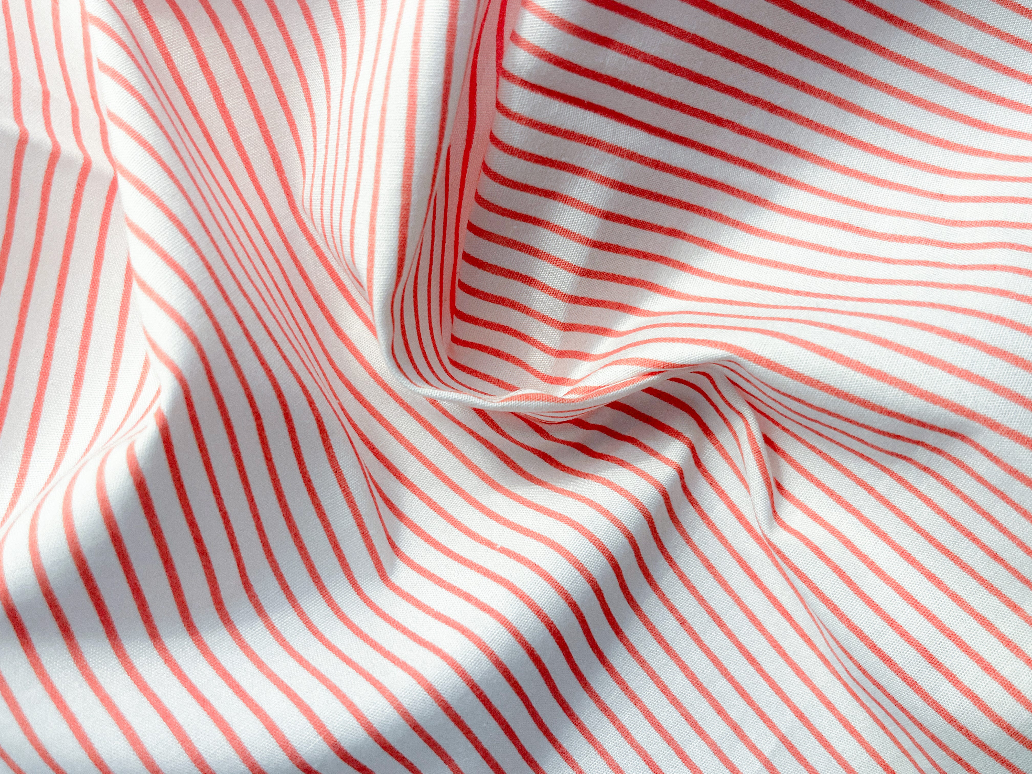
The interest: peach stripe
I’ve never been a big ‘pink’ person. Maybe because of the weight of cultural history around pink being a ‘young’ and ‘girly’ colour (not ideal for someone always mistaken for being much younger than I really am).
But this vibrant peachy-pink shade reads grown-up rather than childish. It’s got personality. Presented in a shirting stripe pattern on white - to borrow a turn of phrase from beloved florist Willow Crossley - it is ‘life enhancing’!
The balance: dusty blue
I adore blue in almost every shade. As a teenager, I went through a phase of strong attachment to International Klein Blue (the specific tint of blue that artist Yves Klein used to great, dramatic effect).
Nearing the other end of the spectrum from Klein’s bold, “my eyes are almost hurting from looking at it” shade of blue, is this soft, light, muted shade of blue. It’s like the colour of a clear sky nearing the horizon.
With a cool undertone, it acts as a palate/palette cleanser (pardon the pun) against the chocolate brown and peach stripe. It’s for days when you want colour (ahem, every day) without the attention.
I imagine this blue’s school report would read, “Quiet achiever, plays well with others.”
Ever faithful: crisp white
A crisp white that works with every skin tone - just what the doctor ordered. It goes with everything, it’s fresh, it’s brightening. What more is there to say?
A modular system
I love modular furniture. It’s hard to count the number of people I have enthusiastically told about my lounge’s modular design when they come over: “Guess what, the arm rests become the back rests! It can turn into 2 smaller lounges! It can become a bed!”
I love that modular design is functional and flexible. That’s the lens I am applying to this next collection. Of course, not only from the perspective of colour choices, but also in the design and construction of the actual styles. Which I’ll save for a future Substack post!
Have a good day,

Gill Pereira is the founder of On A Good Day, an independent Australian clothing label for women up to 160 cm / 5’3”.